YOUR GUIDE TO COLOUR PAIRING
Colour: it’s the key element that will make or break your imagery.
Use too much of it and it takes away from the message you’re trying to send your audience.
Use too little and you run the risk of throwing off your current and prospective followers with a potentially boring image.
There are a few ways to incorporate it into your visual collateral: your brand colours, the ingredients that make up your product, your business values, what inspired you to start the brand… It’s totally subjective with no right or wrong way. The success of it though comes down to execution.
Whether you’re trying to figure out what colours to work into your imagery or simply looking for inspiration, here are some of my most favourite colour pairings to get you started.
PASTELS
A serene look that features soft, muted tones that can be layered with other pastels and neutrals. Given the gentle nature of these colour matches, keep it as the overarching approach to your newsfeed: It can be quite jarring set up next to a darker / cooler palette on your feed if you’re constantly shifting between aesthetics.
Shot & Styled for Essentially Tamara
RED & BLUE
This pair works because they’re complementary colours, sitting opposite each other on the colour wheel.
Keep the background and props quite plain and neutral so that the focus colours shine.
Shot & Styled for Bo + Bala
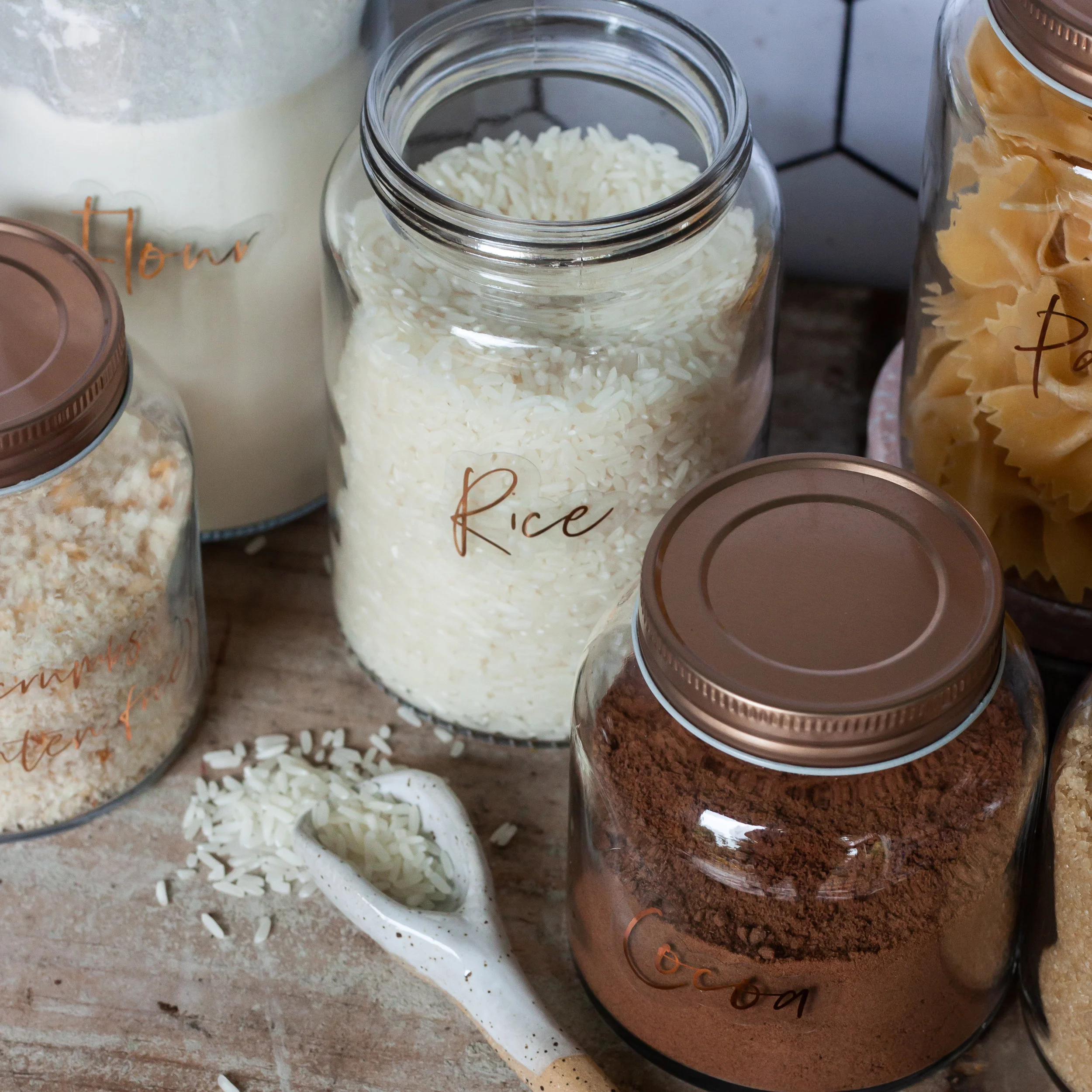
NEUTRALS
Oh man. Warm shades of browns, blacks and ivory. This is my favourite palette and one that endures no matter what the season. It is best used when you’re going for the minimalist look and is especially impactful when texture is layered through the image. You can bring in texture through your props: linens, tree branches, ceramics and even the background like a wooden board. You have my full blessing on this one!
Shot & Styled for Nømad Trading Co.
Shot & Styled for The Ship Shape Shoppe
CRISP WHITE
This is especially effective when paired with bright pops of isolated colour. It ensures that the viewer is focused solely on the hero product and helps to keep the image clean and clear.
Shot & Styled for Biddy + May, featuring (M)Anasi 7
BLUE
I’m a huge fan of this classic, sophisticated palette - particularly when it’s been matched up with crisp white. Layering in tones of blue into the background is a great way to create depth in the image: a simple flower or linen added to the background can achieve this for you.
I also really like it for headshots - blue suits most complexions (it’s about selecting the right tone of course) and when worked into an image with a street or beach scene in the background, it looks really fresh and intriguing.
Shot & Styled for Tigs + Boo
Shot & Styled for Bevan Lynch
What’s your favourite colour pairing? Keen to get fresh new visuals, product shots or headshots done for your business? Get in touch and let’s make it happen.


